
Rebranding initiative.
Conducted RFP to secure partner agency to assist us with our rebranding initiative, which included both the college and athletic logos. Scheduled student, faculty and staff focus groups to obtain qualitative data on perceptions of existing branding. Provided significant input on the final design elements of each logo.
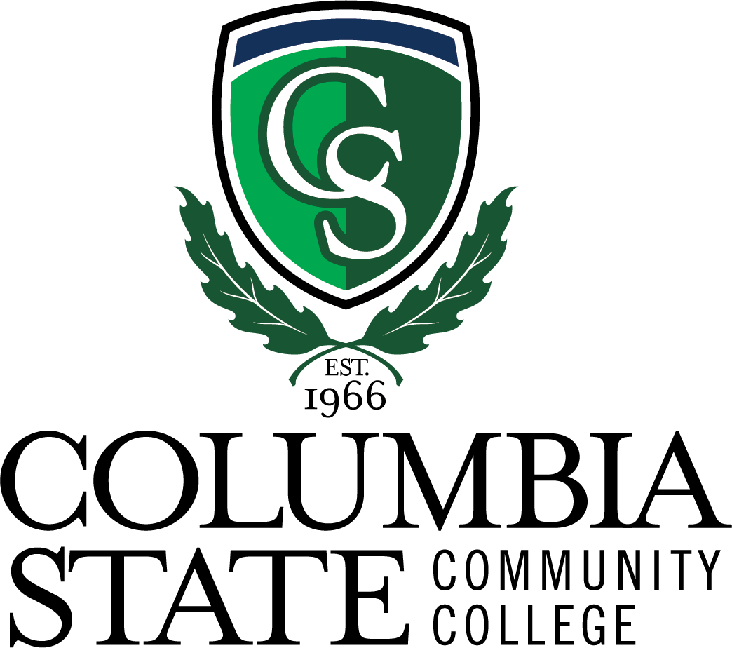
College logo.
The goal of this initiative was to elevate the brand identity of the college. The desire was to move away from the old “three stars” logo, which was a nod to the Tennessee state flag. This new logo was designed to enhance the college’s own identity by giving a nod to the college’s history while also emphasizing the quality of its academic programs.
The shield represents the college’s commitment to academic excellence. The interlocking C and S represents strength and tradition and is a nod to our previous brand identity. The leaves are a representation of the Sawtooth Oak tree, which is one of our most abundant trees on campus. The leaves represent growth and the college’s commitment to sustainability, as well as the college’s designation as an arboretum. The 1966 is a historical reference to our founding as Tennessee’s first community college.
Athletic logo.
The goal of this rebrand was to create a fierce mascot to represent our athletic program. The previous logo contained a knight and horse, which caused confusion over which one was the “Charger.” Thus, the redesign focused solely on the horse to eliminate that confusion.